Wednesday, 27 October 2010

ITAP 3

(12 october)
Researching the content / Researching the practice
Talent, creativity and time are not always enough to create an artwork, an ad, an illustration, a photo. Most of the time there is an extraordinary amount of research that goes into that finished piece to make it what it is. Creating something is a continuous stream of reflection that needs answers – what message do I need to get across, what audience am I targeting, how do I convey it? I am always amazed at how much research artists do when illustrating graphic novels. The story has a time, a place; characters need to look right, be dressed right, backgrounds need to look credible. For example, when Carlos Gomez illustrates the graphic novel Dago for Robin Wood, he needs to create a whole world for this character. The story revolves around the travels of a 16th century Venetian nobleman turned mercenary, moving across every continent and often meeting renowned historical figures, and all these elements need a good deal of research. 
As Gomez himself said in an interview for Fumetteria Arcadia, “research is fundamental. To be able to draw Dago I’ve read many history books to know the facts and also the way people thought at the time. […] I like to take Dago to places that really exist and you can’t set a story in a city without knowing its roads and squares. […] I can’t draw a story set in Bergamo and draw a piazza Vecchia that looks like the centre of Lucca. The reader would be right to get pissed off. You have no idea how many times I have received reports of mistakes.” So you need to be extremely historically accurate to produce a high level work of art, and believe me Gomez is amongst the best.

Something else that is always amazing and extremely useful to research is the way artists work. Every one has their own techniques, a product of that artist’s life. So there is nothing better than to get to see an artist at work, especially if you like the end product. Alessio Fralleone is a Roman artist I was lucky enough to meet during all-arts showcase/competition MArteLive (which he won, by the way). I was simply wandering around the rooms between photography, theatre, fashion, when I saw this sprite of a man, covered in paint, quickly creating an amazing work of art right in front of my eyes.  I couldn’t move until he finished. And I found that watching this artist at work added a great deal to his art as he gets completely immersed in it. No wonder he has gone on to do performance art as well.


Another artist I’ve always admired is Enki Bilal. I’m sure I’ll write more about him further on. He started out with great but quite Moebius-like illustrations, but in time has developed his own unmistakable style. I had always wondered how exactly he got that effect, and was ecstatic when I found this video:

I would love to have that studio, by the way.

Watching the way an artist works is one more way of learning and being inspired and there’s nothing to equal it.

Sunday, 17 October 2010

Weeks 1 to 4 - Illustration Project

"In nuclear physics, nuclear chemistry, and astrophysics, nuclear fusion is the process in which two or more atomic nuclei join together to form a single heavier nucleus. This is usually accompanied by the release or absorption of large quantities of energy." (Wikipedia)
So the 'Fusion' Illustration project had to be about clashing of opposites, different things, different media. The second before the bang when every part still doesn't accept the inevitable. Or at least that is the first thing that came to mind. So I chose my subject, man (or mankind, if 'man' sounds too sexist), and different things that it constantly clashes with. 'Man' became a man and a woman, natural opposites most would say (if you've studied a bit of biology you will know that only one out of 23 chromosomes defines our sex, and we also know that the body doesn't always agree with the mind). Something else man always clashes with is machines, so I threw a little metal in there. I somehow couldn't picture someone in the process of being fused to someone else being perfectly dressed, so the only clothes they are wearing recall (at least in my mind) past times: black and white striped trousers (pirates, circus people and vaudeville come to mind) and a corset (victorian, anyone? even though corsets have been worn for many many centuries) and frilly panties (those comfortable ones you used to wear as a child). Obviously I wanted to use a mix of different media, which ended up being pencils, pen, watercolours, oil colours and oil pastels. I used few colours in different shades, mostly skin tone, black, blue and red, to keep the illustration effective and vibrant. I must say I am quite pleased with the outcome.

Weeks 1 to 4 - Photography Project

My first idea for the photography project, "First and lasting impression of Birmingham", was either a photo of a Big Issue guy or that view you have in front of you while coming just out of the Paradise Forum towards Broad Street. The Big Issue guy idea was because, well, I wouldn't feel at home walking around the centre of Birmingham without them. Plus they have such interesting faces, I thought it would make a good photo. The second idea was because I think that that particular spot of the city shows exactly what B'ham is about: there's the Hall of Memory in its faux-ancient greek style, the mirror-ridden Hyatt, the Symphony Hall, bits of the future new library. It shows old and new styles, the way the city is growing, and with the open air photography exhibition it is currently showcasing it covers the art-driven side of this city. And of course there's always a Big Issue guy. When I went to take the shot though I couldn't seem to get all of that in one good photo. So I looked around a bit more. These were the three I ended up choosing from.
Being from Italy, Birmingham city centre still feels and looks like a very English town...I love this steep road with its 'traditional' (or at least what as a foreigner looks like traditional) colours, and the red phone boxes we expect to see at every corner. This is the photo I ended up choosing for my project, as a foreigners look on Birmingham.

This was actually taken last year during my foundation studies, just before a deadline. My room appeared to have exploded overnight, everything was all over my little student accommodation room in the rush to finish everything. So this felt like like the summary of a very big part of my perception and memory of Birmingham.

A different view of the Hall of Memory, beginning (or end) of Broad Street idea. I like the way it shows a feeling of growth, reaching out to the future with those cranes, with the sky as the limit. But I completely messed up the ISO on my camera that day so I ruined a perfectly good photo. And I preferred to show a different point of view on the city.

ITAP 2

(5th October) 

How do illustrators find inspiration/How do illustrators achieve a personal visual vocabulary?

What inspires us?
Well, LJG Partners have already asked this question to some random people in this video (look out for the guy who answers ‘cold beer’, and the more philosophical one ‘waking up every morning…what else is there?’), but inspiration for an artist is taking it one step further. It is not simply what makes us get up every morning, but what encourages us to create, what gives us ideas for a photo, an illustration, a design, a painting. Obviously everyone has different interests and gets their mind tickled by different things, and that is why I find artist’s sketchbooks so incredibly interesting. They are a map of how that artist’s mind works. Inspiration can simply mean looking around while on those long, interminable journeys on the bus or train, while waiting for that friend that’s always late, while walking down the street. It means listening to music, talking to people, reading book, looking up something you’ve heard about, researching artists. Being inspired means constantly being open to so much different information that your mind never stops working. The only way to keep track of it is to always have something at hand where you can write, scribble, doodle your ideas as they come, because they vanish as quickly as they appear. “Notebook after notebook after notebook because I feel sick when I forget potentially good ideas” said illustrator Paul Davies. And I love it when artists have an online sketchbook, a journal of their ideas and projects. Because obviously it is very difficult to sneak a look at the sketchbook of an artist that is, say, in Australia, or simply just someone you don’t know. The first website of the kind that comes to mind is Miranda July’s, an American performance artist, film director, writer, everything really. It is something like a storage place where she has all the information about herself and her work, and a constantly updated blog where she writes about artists, music, ideas, and mood swings. I love the way it feels so personal and open, as if you’re really looking into her life and mind. Of course all her work is like that, very close to home, infused with charm and irony and open to the viewer, often directly addressing them.


from www.noonebelongsheremorethanyou.com


Constantly jotting down your ideas also helps in another way: it broadens your visual vocabulary. That means that the only way to learn to draw, take good photos, paint, think simply comes down to one thing: practice. If I have never drawn a ship, I will not know how to draw a ship. My hand won’t have any memory of it, and the most that my mind will be able to come up with is the vague idea of a ship. Have you ever realized how so many familiar things we have never looked well enough to be able to describe in detail? So constantly practicing is the only way to better as an artist. Someone who took this concept to a whole new level is Jason Polan, American illustrator who has made of his quick sketches a big part of his work. Examples: “The Every Piece of art in the Museum of Modern Art Book” (exactly what the title says it is, you got it) and “100 People I saw Today”.

Jason Polan, from 100 people I saw today and One person I saw today 100 times


Jason Polan, page 3 of The MOMA book

Jason Polan, page 7 of The MOMA book

Friday, 15 October 2010

Artism.


I don't know who this is by, but I find it extremely funny.

Showcase: Nikon Small World

Nikon Small World is "regarded as the leading forum for showcasing the beauty and complexity of life as seen through the light microscope" or so their website says. The 2010 Competition, as all the previous years, features an amazing insight into microscopic life and photography, showing us images of things that, apart from being impossible to recognize, we would probably never get the chance to see this close up.
While the winner was Jonas King's Anopheles Gambiae (mosquito) heart, I must say my favourite was second place Dr. Hideo Otsuna with his photo of a 5-year old zebrafish head. It might just be because of the fluorescent colours (I know I'm a little kid inside), which a link on the site explains the process used to gain, or the fact that this explosion of a raver's dream is actually a very detailed photo of a fish's head which makes it even more interesting, but this is definitely a photo I could look at for hours. It's unearthly, colourful, interesting, detailed and, absurdly, something that actually exists.


Hideo Otsuna, 5-year old zebrafish head

Audrey Montoya

Browsing the web is more interesting when it involves stumbling.
I have no memory of how I found this artist, but I find her work amazing. Her name is Audrey Montoya and the only link I seemed to find about her was her own personal blog, Watercolors by Audrey Montoya, right here on blogspot. I have been always more interested in people than, say, landscapes. And Audrey does amazingly brilliant watercolour portraits of, I'm guessing, friends and family.
This is my favourite piece by her:


ITAP 1

(28 october)

Notions of originality/Can recontextualised ideas be contemporary?

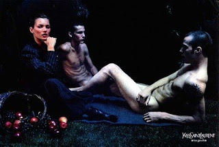
Many people who have in their mind the idea of becoming artists probably think of themselves as extremely creative and original. But possibly one of the first things to realize, choosing this road, is that no idea is original. Everything has already been thought of in one way or another. The human brain thinks in similar ways, and the simple fact that everything we can create is based on inspiration makes it so that nothing is original. There is nothing wrong about this, and we cannot escape it.  No idea can be formed, except maybe very simple ones, without being influenced by our surroundings, and starting a degree means there are at least 20 years of influence in our minds. So we discover that our idea of originality does not exist; what does ‘original’ mean then in the present day? Maybe being able to create something interesting and ‘new’ with all those images, words, ideas that our mind has processed. When an aspiring artist has realized this, I think he or she (or can we consider artists an ‘it’?) has only one way to go: learn. Learn as much as we can about the world we live in, the different artists that surround us, and the ones that have come before us. This means having to accept at an even deeper level that everything has been done, but after having overcome that obstacle it is an eye-opener, a constant creative input. Because maybe that is what makes an artist’s mind different: seeing something and wanting to change it, personalize it, make it into something different that appeals to our mind. Or maybe sometimes simply wishing we had done that particular piece (but not pretending we actually have, that is obviously plagiarism). So being original becomes synonymous of changing, modifying, moulding, recontextualising ideas to make them personal, modern, to make them into something different.

An example of how an idea has been recontextualised during the years: Manet's 'La Déjeuner sur l'Herbe' (1863)

Edouard Manet, 'Le Déjeuner sur l'Herbe' 1863

Pablo Picasso, 'Déjeuner sur l'Herbe' 1961

Bow Wow Wow's cover for 'I Want Candy' 1982

Gilbert Shelton, 'Les fabuleux Freak Brothers' 1982

Yue Minjun, 'Déjeuner sur l'Herbe' 1995

Alexander Vinogradov &Vladimir Dubosarsky, 'Le Déjeuner sur l'Herbe' 2002

Mario Sorrenti, Yves Saint Laurent Rive Gauche, 1998

Milo Manara, in 'Giuseppe Bergman' 2005

Captain Caverne, 'Le Déjeuner sur l'Herbe' 2009


[The internet is a limitless source. Some of the pieces linked to La Déjeuner sur l'Herbe I already knew, others I found on this site who has done a brilliant job]

post n.2

So far, between a broken laptop and my natural tendency to procrastinate, this blog has been left to fend for itself. But things need to get done, and after all, having an online place to store and show every interesting find is definitely great. I've blogged before, but always casually, never with a real purpose, so I suppose I can consider this the start of something new.
As for now, I have started my degree in Visual Communication (probably focusing more on Illustration) at BIAD, and this is the blog I've set up for research, quick showcasing, lecture reviews and who knows what else. Let's see how far this can go.

Ingrid Schram on The Selby

Saturday, 2 October 2010

post no. 1

"William, surely you know that everything that exists imagined itself into existence?"


Egon Schiele, Standing Male Nude With a Red Loincloth


(The drawing acting as profile picture is "La Bande Dessinée"  by Enki Bilal. Amazing.)