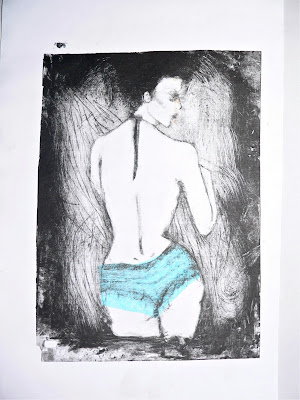
I tried out a little drypoint, a printing technique that gives an interesting feel. It was fun and seems to get easier quite quickly. I might use it in the future, but definitely not for the current project as it is a quick 2-week one so I don't really have the time to master a new technique that is so fiddly and difficult to control. But it has been fun to experiment.
Tuesday, 30 November 2010
Thursday, 18 November 2010
ITAP 6
Interpretation/Testing
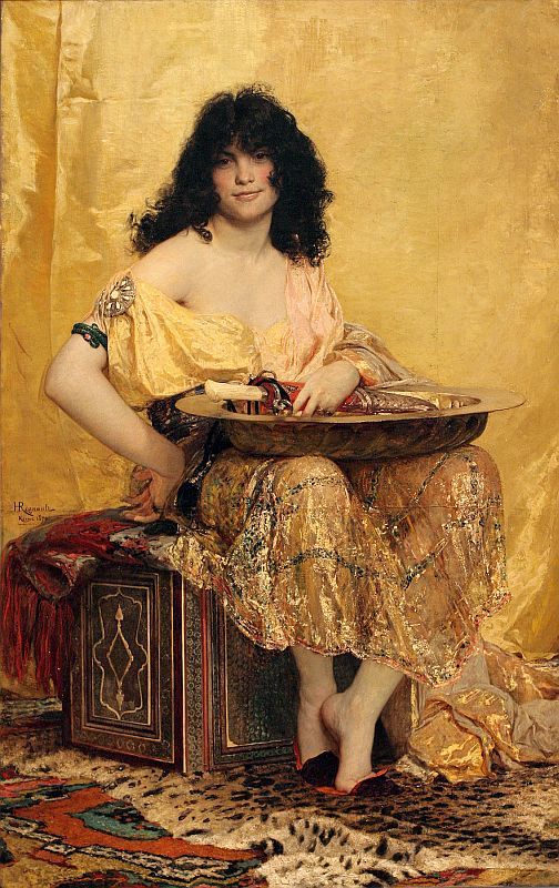
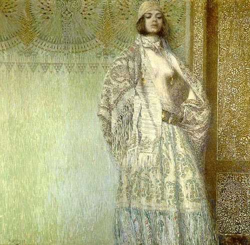
When getting a message across to an audience, the artist must relate to its chosen public. This can mean obviously finding ways to target a specific audience, i.e. teenagers or families, but it is first of all relating to the zeitgeist, the “spirit of the time”. People probably don’t do it all too consciously as they are living the spirit of their age and time, but looking back to past works of art or the way a single subject has been portrayed throughout the years and centuries this is very much more notable. As an example I will use Salome. This character appears for the first time in the New Testament as the stepdaughter of Herod, as an icon of female seduction, dangerous and tempting for the good man of faith. She was a favourite subject of Christian paintings, the femme fatale using her body to ask for the head of John the Baptist, the incarnation of woman’s evil power.
Come the mid-1800, the aesthetics, symbolism, dandies, and decadence, Salome was brought back to the spotlight, thanks to Oscar Wilde’s play and subsequently Richard Strauss’ opera, as a new-found symbol of female seduction. She was the perfect ideal of the woman aesthetics longed to meet. In the years she became protagonist of ballets, poems, songs, films (often transcript into modern times), sometimes going back to that judgmental Christian ideal of female perversion, sometimes as the adored seductress.
Come the mid-1800, the aesthetics, symbolism, dandies, and decadence, Salome was brought back to the spotlight, thanks to Oscar Wilde’s play and subsequently Richard Strauss’ opera, as a new-found symbol of female seduction. She was the perfect ideal of the woman aesthetics longed to meet. In the years she became protagonist of ballets, poems, songs, films (often transcript into modern times), sometimes going back to that judgmental Christian ideal of female perversion, sometimes as the adored seductress.
| Titian |
 |
| G. Moreau |
 |
| H. Regnault |
 |
| A. Beardsley |
 |
| A. Mucha |
 |
| V. Surenyants |
In other times, the only way to test your work was to throw it out there, show it to critics and public and see how well (or how badly) it was received, hoping for the best. Nowadays us artists are on much safer grounds. Showcases and exhibitions, however big or small, are obviously a good way to get attention and put your work on display. Our most powerful tool though is the Internet. Thanks to blogs, websites, forums, and emails we can easily display our work, ask for feedback and see what comes out of it. As most recent artists have some kind web-based portfolio, everything becomes only a few clicks away. And so getting feedback on your work, professional or just at doodle stage, is incredibly easy and immediate.
Tuesday, 16 November 2010
Itap 5
Character design/Digital storytelling
Characters are one of the most important part of any story. Having a character that the audience love, hate or can relate to makes the whole difference in any film, graphic novel, illustration, or ad. Of course every type of media needs and has its own particular requests. The audience as well plays a great part in it. An ad that needs to reel in young people will obviously need different characters than one targeting families or pensioners. This year’s British Gas adverts target families using simple, computer generated characters.
I have always loved films and graphic novels, and have always been interested in people. So I always love getting to know well-designed characters. I might even go as far to say that I prefer characters to real people, because you get to know them so much better (even if they are just fictional). And sometimes a character is so particular that it stays in people’s hearts and minds. In Italy I would say that some that have done so are Crepax’s “Valentina” and the Giussani sisters’ “Diabolik”, but of course the same goes for, say, Tank Girl or any of the Marvel and DC superheroes.
Characters need to be well thought out, starting from their role (protagonist, antagonist, sidekicks etc), appearance, actions, interactions, right down to the dialogue they use.
Nowadays there are so many existing platforms that many stories exist in many places – books, videos, games, films. Setting apart stories that have started out as books or graphic novels to then become films and gadgets, many stories exist and are born on a multi-platform level. This seems to happen especially with tv series, Doctor Who, Level 26, Misfits just to name a few.
The American series Heroes, for example, comprises of the actual series, the spin-off Heroes: Origins, blogs for each character, games, various merchandise, viral videos and comic books going more in-depth about different character’s stories. This is obviously done when targeting a “young adult” audience who is used to using the internet every day, and not a more mature audience who would probably not be waiting for the new series with enough anticipation to go and look for games and mini-videos.
The American series Heroes, for example, comprises of the actual series, the spin-off Heroes: Origins, blogs for each character, games, various merchandise, viral videos and comic books going more in-depth about different character’s stories. This is obviously done when targeting a “young adult” audience who is used to using the internet every day, and not a more mature audience who would probably not be waiting for the new series with enough anticipation to go and look for games and mini-videos.
ITAP 4
RVJ- draw, work by hand/develop visual language
A reflective visual journal is an indispensable tool for any artists, and illustrators especially. Our whole work is based on a visual language that is developed only with time and constant practice. A journal is the place where we can sketch, experiment, and stick down interesting things, develop ideas and take them from just a mere doodle to a semi-final stage. It is the one place where all our ideas are set down to develop, leave, and find again. While I might be absolutely stunned by a work of art, I find visual journals far more interesting because they show the process, and the ideas that have made the final outcome what it is. It is a place where we, as artists, can safely experiment to broaden our visual language and use different materials.
Drawing and working by hand is an essential part of an artist’s creative process. It gets our right brain into gear, something that in this bureaucratic world happens very rarely. In a single action it engages hand, eye, and brain. As artist and as people we are always extremely self conscious about our outcome, about producing something that is “good enough” even if it’s just on a napkin in a café. An rvj is the place to get over that self consciousness and self judgment, and be free to experiment and get used to doodling for ideas. And drawing by hand is the simplest way to get our creativeness going. It doesn’t matter if you’re no Leonardo Da Vinci, getting used to drawing by hand is a precious habit to get into.
Thinking in terms of images instead of words involves a completely different part of the brain. The right brain is the creative half, the left brain is the evaluative half. School has taught us to work with words, so that is what comes more natural to us, but it is important to teach ourselves to work visually, using images instead of text. Images can make complex ideas much simpler and comprehensible, and are far more effective than describing something in words. Commoncraft demonstrate this perfectly. Working visually does not obviously mean cutting out words completely, but integrating text with images. Words can be used to evaluate your work after having tried out different possibilities, or as an integrating part of an image. But the only way to be able to create an effective visual language is practice and being able to recognise a visual vocabulary, a set of signs that can get whatever message we need t convey across to the receiver, even if that is just us, the artists.
(well, ok, zombies might not be a complex idea, but you get the point)
Sunday, 14 November 2010
Sergey Chilikov (and Beirut)
Sergey Chilikov is a Russian photographer. His photos seem to me as very sincere snapshots, something your parents could have taken on a family holiday. The 'old', faded colours and movement caught on the pictures make them look extremely personal, close to the heart, and they give an interesting insight into Russian lifestyle, from a Russians point of view.
He gained a bit of attention when two photos of his were used by the indie folk band Beirut, who found them torn out of a book in a library in Leipzig. And I find Chilikov's photos to suit perfectly Beirut's style.
Friday, 12 November 2010
Wednesday, 3 November 2010
Hugo Pratt
"He's dreaming with his eyes open, and those that dream with their eyes open are dangerous, for they do not know when their dreams come to an end."
A great Italian comic book artist. If anyone knows French there's an interview here.
A great Italian comic book artist. If anyone knows French there's an interview here.
Tuesday, 2 November 2010
Looking at the Overlooked.
Making visible the invisible through type.
"This project will explore the use of type and text in Illustration and examine the broader context of text within Fine Art to introduce alternative ways of creating images", says the brief.
This is the first project since choosing Illustration as my specific path and it is daunting. The reality is, even though I have always used text when creating short graphic novels, I have never really had a particular interest in type and text. So this field is pretty much completely new to me. I initially had no idea how to approach the project, or if I'd even enjoy it, but I've discovered that it actually does interest me and has unconsciously appealed to me all my life. I've always loved writing and the power of words, so this is just a way of giving them even more force.
First of all I explored Digbeth, using my camera to document interesting looking fonts and signs. And I love the gritty, rundown, mixed feel of Digbeth. Creating something on wood and then destroying it, or letting the weather destroy it, might be something I could look into.
I've also looked into vintage carnival posters, I just love the idea of having a "See The Amazing Snake Woman!" or something (but Birmingham related), with an Illustration as well and a weathered, tattered look.
Another thing that has interested me is writing in different materials, maybe metal or plastic, photos, objects or wool.
Lastly, I have looked into Futurism and Dadaist poetry. I especially adore Apollinaire's Calligrammes ("shaped poetry", a development of what in Latin poetry was called carmen figuratum) . What is particular about poetry from these kinds of artistic movements is the way they use the words on the page as images to better convey the message. Futurists especially also add drawings and are very free about the way they put down words on a page; poets and generally writers from these movements are very experimental and that is always something to be inspired by. I also find them very similar to Islamic calligrams, which are even more beautiful as the Arabic alphabet is so fluent and illustrative.
"This project will explore the use of type and text in Illustration and examine the broader context of text within Fine Art to introduce alternative ways of creating images", says the brief.
This is the first project since choosing Illustration as my specific path and it is daunting. The reality is, even though I have always used text when creating short graphic novels, I have never really had a particular interest in type and text. So this field is pretty much completely new to me. I initially had no idea how to approach the project, or if I'd even enjoy it, but I've discovered that it actually does interest me and has unconsciously appealed to me all my life. I've always loved writing and the power of words, so this is just a way of giving them even more force.
First of all I explored Digbeth, using my camera to document interesting looking fonts and signs. And I love the gritty, rundown, mixed feel of Digbeth. Creating something on wood and then destroying it, or letting the weather destroy it, might be something I could look into.
Another thing that has interested me is writing in different materials, maybe metal or plastic, photos, objects or wool.
Lastly, I have looked into Futurism and Dadaist poetry. I especially adore Apollinaire's Calligrammes ("shaped poetry", a development of what in Latin poetry was called carmen figuratum) . What is particular about poetry from these kinds of artistic movements is the way they use the words on the page as images to better convey the message. Futurists especially also add drawings and are very free about the way they put down words on a page; poets and generally writers from these movements are very experimental and that is always something to be inspired by. I also find them very similar to Islamic calligrams, which are even more beautiful as the Arabic alphabet is so fluent and illustrative.
 |
| Corrado Govoni, Il Palombaro |
 |
| Guillaume Apollinaire, Il pleut |
We were told in the project presentation about the Baskerville font, created by Birmingham-born John Baskerville. We also had a workshop on ScanFont and FontLab. To be honest, I loved the really quick and messy font that the technician created. I do want to experiment with these programs but I don't think I have the patience to create a carefully planned font.
So I've moved away from that first terrifying "blank page" moment, and now find myself with so many ideas I'm not really sure which way to turn.
Monday, 1 November 2010
Hallowe'en.
This year I abandoned my Queen of Hearts dress. DIY skeleton costume for a Mystery Murder Dinner Party in the way forward, I'll tell you. I discovered the murderer as well, proving that watching crime drama tv series does occasionally pay off. And I learned a little more about anatomy as well. All you need is a black dress (any length - baring all is ok for Halloween, in case you didn't know) and white acrylic. A white pen to draw with is actually quite useful as well. Aaand I guess white face paint and some heavy black make up. But there's loads of tutorials for that on youtube.
 |
| back |
 |
| front |
 |
| dress and makeup |
 |
| detail - heart and measuring tape (i was supposed to be a skeleton with an eating disorder) |
Subscribe to:
Comments (Atom)


_01.jpg)


